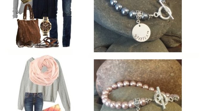
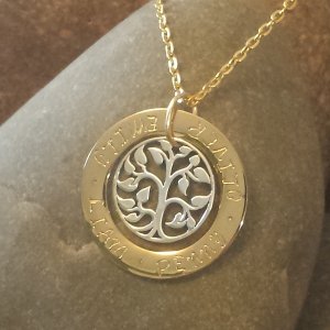
Choice of four different designs of Mother’s Necklaces.
GIVEAWAY TIME! Mother’s Day Special!
Mother’s Day is just around the corner. Treasure your loved ones by hanging their names around your neck! A great gift for proud mums, grandmothers or mums-to-be. Your choice of one of four styles, personalised with hand stamped names into the metal, and choice of Swarovski Crystals, Swarovski Pearl or Tree of Life Charm (to any design).
To Enter: Visit our Facebook page and comment on the photo which style you would like to win and why you think you or your mum/grandmother/wife is a special mum. To be in the running you must Like and Share the giveaway post as well as be a liker of the page.
Winner will be drawn Sat 8pm (EST). Australian Residents Only.
Watch the video on how to make some fantastically textured black and silver day wear earrings using black glass oval beads and antique silver findings. Simple, yet classy, these earrings go with many outfits and can be tweaked to incorporate your favourite colour. The video includes step by step instructions, hints and tips. The bead kit can be purchased at http://www.sewtree.com
Watch the video on how to make some gorgeous purple and aqua earrings using glass foil lampwork beads. The video includes step by step instructions, hints and tips. The bead kit can be purchased at http://www.sewtree.com
Do you have an eye for colour? I have never been sure whether I do or not. My mother certainly does. She can mix and match colour palettes better than anyone I know and be able to see shades of tone that just baffle me. Oh course I studied colour theory at University but that was only a scratch in the surface. I pick colours that appeal to me when I sew or pick out beads, certainly one shade appeals more to me than another. However, when it comes down to it, just how good is the average person at identifying colours? I am constantly reminded of Claude Monet who had cataracts and his perception of colour changed over time. What I see as forest green is it the same as what you perceive? Is my sight limited to see only large differences in tone or could I pick out the most subtle of changes…?
Claude Monet – Water Lily Pond
Well, I found this Online Colour Test (link below) that asks you to put a large swatch of colour blocks into order by hue. It is hard. The more I looked at it the more they looked the same. My first score was 11 (about a 1/5th wrong, mostly in the purples). I am sure I could beat that (looking at it at almost 10pm at night probably does not help my concentration).
Every year since the year 2000, the Pantone Color Institute selects a colour to be ‘Color of the Year’. It is a specific colour chosen by experts that look all around the work for what influences entertainment, film, fashion, jewelry, art, economy, travel, technology, industrial design, sports, politics etc. The experts take many many months to scour the globe looking for what represents the global zeitgeist, the mood of the world, what people are striving for in their lives. Last year it was Emerald, symbolising growth, renewal and prosperity. Heavily influenced by a recovering economy and environmental issues.
This year, Color of the Year for 2014: Radiant Orchid, PANTONE 18-3224. A gorgeous shade of pink-purple. The colour represents a radiance, imbued with a sense of creativity, exotic and intriguing, it inspires a sense of uniqueness for which each of us strive to have.
However the Pantone colours inspire you, you will see a lot of this colour in 2014 in fashion, make up and design.
SewTree loves this colour. It’s girlyness, relaxing, refreshing and calming effect really calls to me. You can expect many of our pieces this year to incorporate this colour.
How does colour call to you in your life? Do you paint your walls with it? your nails? use in your crafting? do you pick your children’s clothes based on your favourite colour? or maybe you unconsciously surround yourself with the flowers in your garden or wardrobe?
Tell us: What are your favourite colour? how do you use them and how do they make you feel?